Accessibility: the true pillar to designing inclusive products
| Cropster
Written by Renzo
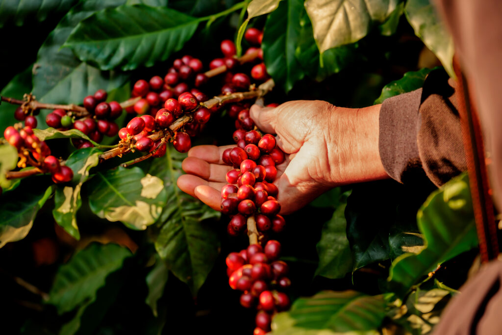
At Cropster we strive to make usability our true north. Our software solutions are used worldwide and have been translated into more than 10 languages. That is a lot of passionate coffee people around the globe, with different cultures and preferences. How can we provide products that simplify tasks, improve efficiency and are easy to use for each and every one of our customers? We accomplish this by embracing the benefits of a user-centered design approach, letting our users guide us. By utilizing surveys, interviews and user testing during work cycles, users can tell us a lot about their pain points. All of their feedback matters and helps us improve our products and features continuously.
In our quest for better products, accessibility is another key concept that we focus on. In case you aren’t familiar with it, accessibility was for a long time the not-so-popular (and sometimes even looked down upon) sibling of usability. Why? Because there is the misconception that it represents an extra push of hard work right after business goals have already been fulfilled. Accessibility means placing the bar higher, improving our products considering as well people with disabilities, planning and allocating in advance the time and resources to make the necessary adjustments.
In today’s world, products and processes should be mature enough to consider accessibility an essential part of them. Hopefully, soon, products that do not take that extra step will be left aside by users. As they should be, right?
Let’s use color blindness or the inability to distinguish colors as an example. More than 350 million people around the world suffer from color blindness. Statistics show that approximately 1 in 200 women and 1 in 12 men are affected by a color vision deficiency. Surprisingly, when looking at the current trends in design, we find many new and modern digital products are designed without efforts to comply with basic accessibility. For example, in the picture below, we see an attempt to make things stand out by dropping some incredibly vibrant colors.

A trading tool’s interface that uses some vibrant colors and a dark background.
Sure, it looks cool and does the job. But after a minor accessibility analysis, it is clear that for color blind people the user interface (UI) becomes flat and users may find it difficult or impossible to perform their tasks (look at the contrast between green/red in the next image above, showing market fluctuations for each day as positive/negative, and how they look in the image below once a color-blind filter is applied).

A trading tool’s interface through the lens of deuteranopia or called “green-blindness”
When using a dark UI, design decisions should also consider aspects such as the kind of tasks and what time of day they are performed, the need (or lack) of a strong focus on specific UI elements, readability, available time for decision making, etc. A dark UI in a streaming service used mostly at night might make sense, whereas in products or services displayed on screens during daylight, probably not. Our eyes constantly adapt to light variations and adding extra work can make us feel tired earlier on.


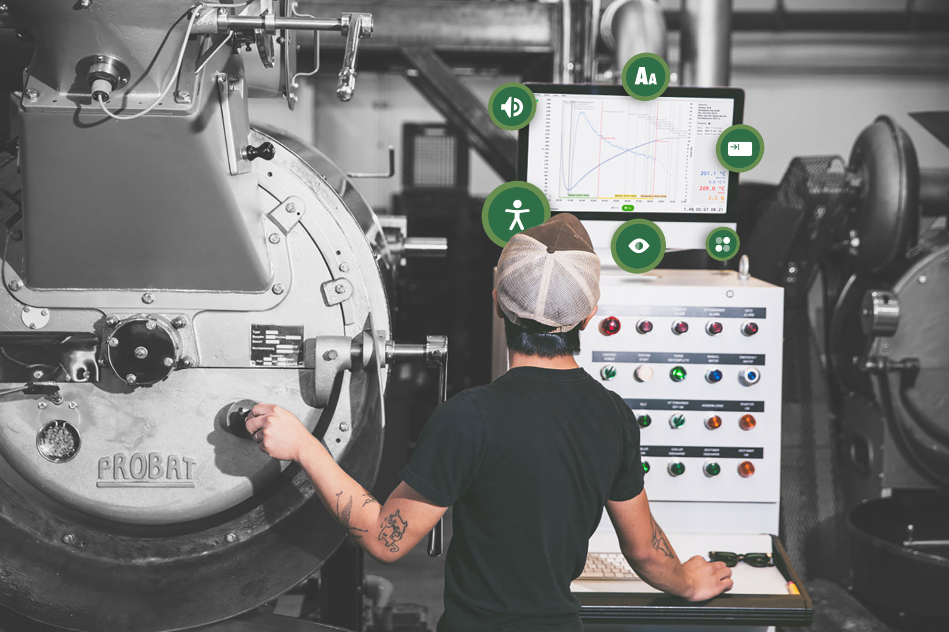
Cropster Roast Intelligence software also tested under “green-blindness”
In our coffee roast profiling software Roasting Intelligence, we considered all of these design aspects. Charts, machine readings and labels sit harmonically on a white, spacious UI. In the sidebar, for example, readings have their own color to be easily distinguished, but contrast is controlled and the readings are labeled to ensure accessibility for all. Since our software is usually displayed at a distance from workers, we used a monotype font for the readings to avoid jumps. Lastly, when transferred into the chart, readings translated into curves have a specific place with enough space to help quickly grasp where to find them (although for an expert roaster, the RoR curve, for example, is immediately clear even at a distance).

A coffee roaster, using our Roasting Intelligence software to support his tasks
We keep trying to discover new ways to move forward and improve the usability and accessibility of our products, whether it is by examining fresh projects under the Web Content Accessibility Guidelines, regularly reviewing and updating our style guides, components and products or meeting weekly with our Support and Customer Success team to discuss and discover design issues.
Accessibility and usability are very important to us and that is why we make both aspects an active part of our product cycles, not just an afterthought. It’s simple, we want to keep on working to set the bar even higher. For the days to come, inclusive products should become the norm.